giveXchange
Overview
giveXchange is a closed-community marketplace enabling members to buy and sell products effortlessly across multiple categories. LaunchBox Global developed a mobile app, web app, and admin dashboard, ensuring a seamless and engaging experience for all users. The project, completed in 16 weeks, belongs to the eCommerce / Marketplace industry.



Time
16 Weeks

Domain
Marketplace / eCommerce

Our Contribution
Complete UI/UX Design for Mobile Application



The Challenge
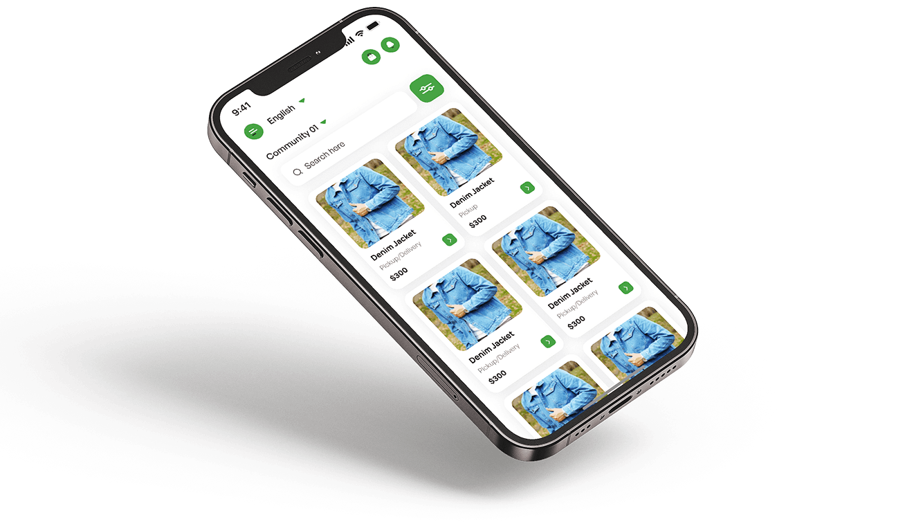
Creating GiveXchange required solving several interconnected UX and technical hurdles to ensure the platform felt seamless, secure, and enjoyable for a closed community. The challenge was to design an experience that balanced trust, usability, scalability, and smooth navigation—across both mobile and web—without overwhelming users as the marketplace grows.

Designing a fluid user journey
That allows members to effortlessly buy and sell within a private community, minimizing friction at every step.

Maintaining consistency across mobile and web
Ensuring both buyers and sellers experience intuitive interactions.

Building a scalable architecture
Capable of handling thousands of listings without compromising performance.

Preventing user fatigue
By streamlining browsing across a large, multi-category product catalog.

Integrating secure payments, messaging, and admin tools
While keeping the interface simple and user-friendly.
Our Objectives
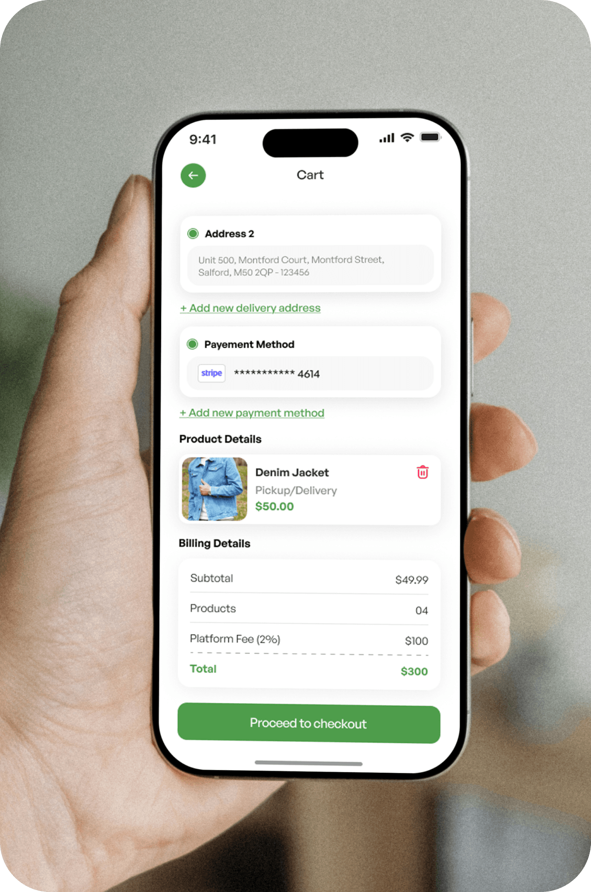
Our primary objective was to design a marketplace that feels effortless, secure, and community-driven—one that users can trust and enjoy using every day. We focused on creating a foundation that not only delivers smooth buying and selling experiences but also supports long-term scalability as the platform grows. The aim was to strike the right balance between intuitive user flows, powerful admin capabilities, and stable performance, ensuring the client could confidently expand their ecosystem while maintaining a high-quality experience for all members.


Simplified Flows
Browsing, buying, and selling are designed to feel intuitive and seamless, allowing users to complete every step with ease and minimal friction.
Secure & Trusted Experience
Robust security measures and reliable systems create a safe, trustworthy environment for users to transact with confidence.
Scalable & Future-Ready
The platform is built to grow with the business, ensuring consistent performance and a high-quality experience as the ecosystem expands.
Powerful Admin Controls
Flexible admin tools make it easy to manage users, listings, and operations efficiently without adding complexity.
Community-Driven Design
The experience is built around real user needs, encouraging engagement, trust, and long-term participation across the platform.
Discovery & Research
The discovery phase laid the foundation for a solution that truly aligns with how users think, search, and interact within a closed marketplace environment. Our goal during this stage was to uncover real user needs, validate assumptions, and understand the competitive landscape so we could design with clarity and purpose. By combining user insights, technical exploration, and feature prioritization, we shaped a direction that balanced usability, trust, and long-term scalability. This research ensured every design and development decision was rooted in evidence rather than intuition.

User Research
Interviews and surveys revealed how buyers and sellers behave, what motivates them, and where common frustrations occur.
Competitor Review
Analyzed existing marketplaces to spot UX shortcomings and opportunities for meaningful improvements.
Feature Priorities
Identified core features like listings, filters, chat, and secure payments to guide MVP scope.
Tech Exploration
Evaluated tools and frameworks to support performance, flexibility, and future scaling.
Workflow
To build a platform that feels intuitive and purpose-driven from the start, we followed a Functionality-First Workflow. This approach allowed us to prioritize clarity, usability, and performance before introducing visual polish. By grounding every step in real user needs and continuous testing, the workflow ensured the product evolved in a structured, meaningful way. Each phase contributed to a marketplace experience that is dependable, scalable, and easy for both users and admins to adopt. This method kept the project aligned with core objectives while maintaining momentum throughout design and development.


01
Core Functions
Defined essential features for buyers, sellers, and admins to guide the foundation of the platform.

02
Iterative Sprints
Developed features in cycles, validating usability and refining interactions as we progressed.

03
Wireframes & Prototypes
Created simple, navigable flows that reduced friction and clarified user decision-making.

04
Final Optimization
Enhanced responsiveness, performance, and visual consistency to prepare the product for launch.
01
Core Functions
Defined essential features for buyers, sellers, and admins to guide the foundation of the platform.
02
Iterative Sprints
Developed features in cycles, validating usability and refining interactions as we progressed.
03
Wireframes & Prototypes
Created simple, navigable flows that reduced friction and clarified user decision-making.
04
Final Optimization
Enhanced responsiveness, performance, and visual consistency to prepare the product for launch.
Wireframes
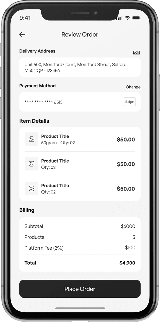
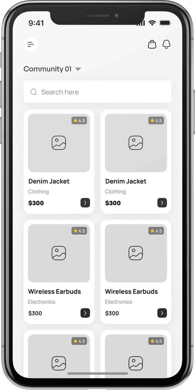
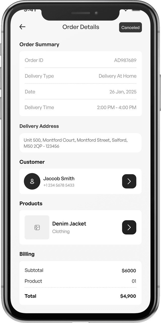
To build a platform that feels intuitive and purpose-driven from the start, we followed a Functionality-First Workflow. This approach allowed us to prioritize clarity, usability, and performance before introducing visual polish. By grounding every step in real user needs and continuous testing, the workflow ensured the product evolved in a structured, meaningful way. Each phase contributed to a marketplace experience that is dependable, scalable, and easy for both users and admins to adopt. This method kept the project aligned with core objectives while maintaining momentum throughout design and development.
Branding
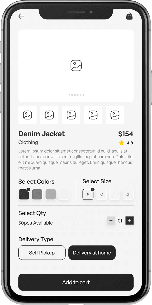
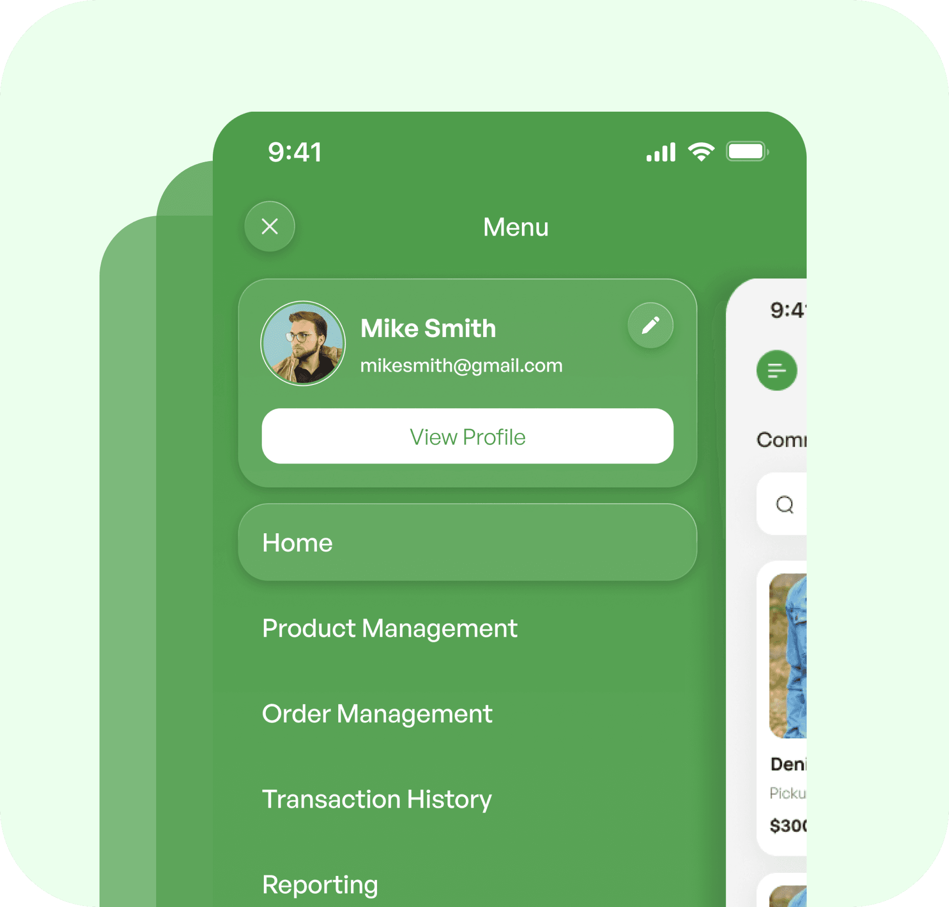
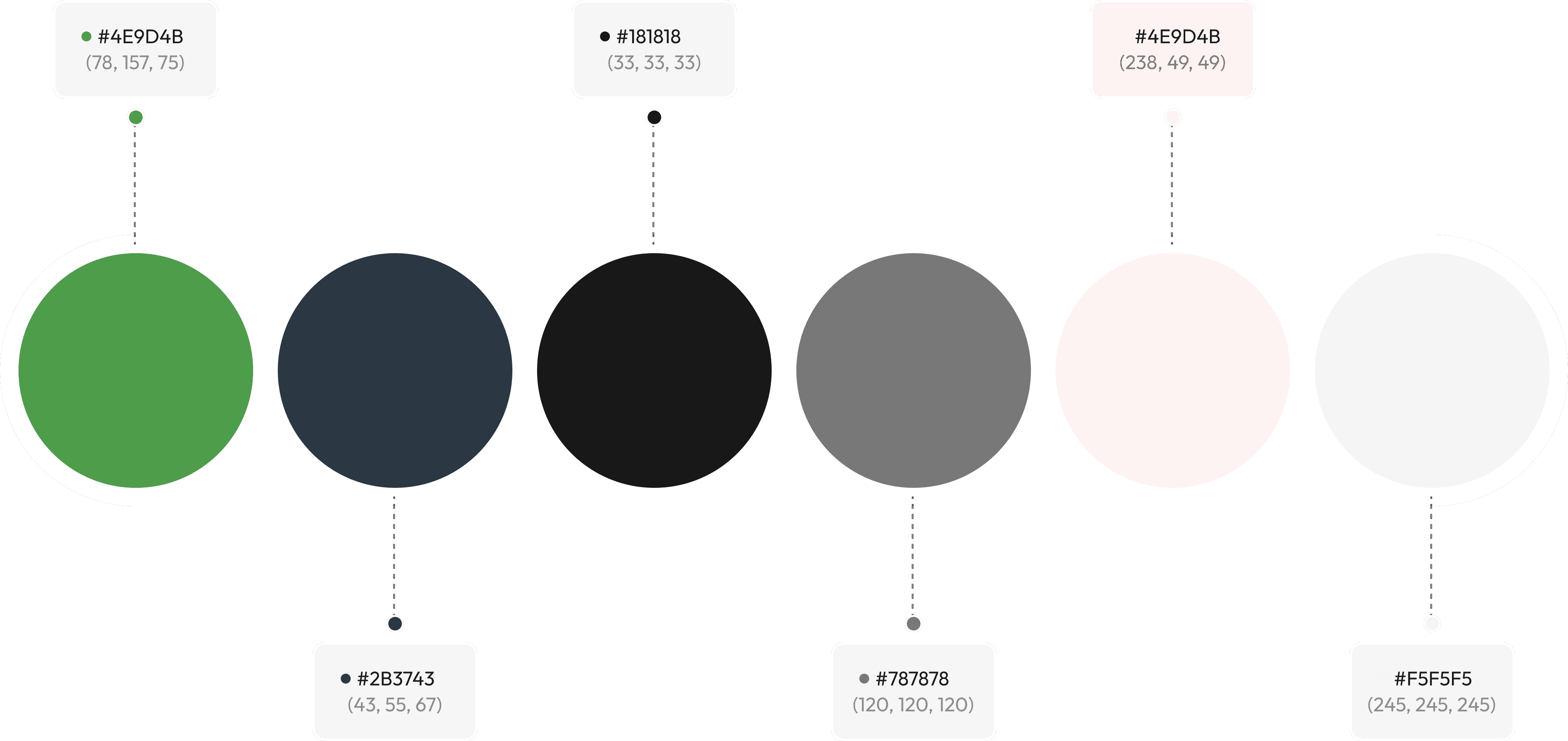
The GiveXchange brand was designed to communicate trust, simplicity, and a sense of shared community from the very first interaction. Our goal was to build an identity that feels modern and reliable while remaining warm and approachable for everyday users. By establishing a clear visual language—supported by cohesive typography, iconography, and color direction—we ensured the brand could scale consistently across mobile, web, and admin environments. The result is a unified experience that reinforces credibility, improves usability, and strengthens the platform’s overall personality.
Color & Typography
General Sans was selected for its clean, modern look and strong readability. Its balanced shapes help create a clear visual hierarchy, keeping the interface simple, consistent, and easy to navigate across all screens.

Headline
Font size: 24px | Line Height: 130%
Title
Font size: 16px | Line Height: 130%
Body
Font size: 12px | Line Height: 130%
Button & Tag
Font size: 14px | Line Height: 130%
Problems & Solutions
The mobile app needed to support smooth navigation, strong performance, and secure interactions as the marketplace grew. Balancing scalability with ease of use was essential, especially with features like payments and messaging integrated directly into the experience.

Problem 1
Catalog Performance
Studied Indeed, Coursera, and LinkedIn Learning to identify UX gaps in career-learning hybrids.


Solution 1
Lazy Loading
Loads content progressively, improving speed, reducing memory use, and keeping browsing smooth.
Problem 2
Category Navigation
Designing a structure that helps users move naturally between categories and discover products quickly.
Solution 2
Streamlined Navigation
Clear category pathways and simplified interactions help users explore with minimal effort.
Problem 3
Screen Consistency
Maintaining a unified experience across different devices, resolutions, and orientations.
Solution 3
Adaptive Layouts
Responsive components ensure visual consistency and usability across all screen sizes.
Problem 4
Secure Feature Integration
Adding payments and messaging while keeping the flow simple, stable, and interruption-free.
Solution 4
Secure Transactions & Chat
Encrypted processes and integrated messaging offer safety without compromising convenience.
Tech Stack & Tools
Our chosen technology stack ensured strong performance, smooth communication between platforms, and the ability to scale as the marketplace grows. Each tool was selected to support fast development, efficient data handling, and secure user interactions across mobile, web, and admin interfaces.
Mobile App
For cross-platform consistency, real-time data, and secure payments.
 React Native
 Redux
Redux Firebase
 Stripe API
Web App
Fast rendering with scalable backend architecture
React Node.js
 REST APIs
 Chart.js
Design Tools
Collaborative UI/UX design and rapid prototyping
 Figma
Figma Adobe XD
Admin Dashboard
Efficient management tools with clear data visualization
ReactNode.js Express
 MongoDB
Final Outcomes
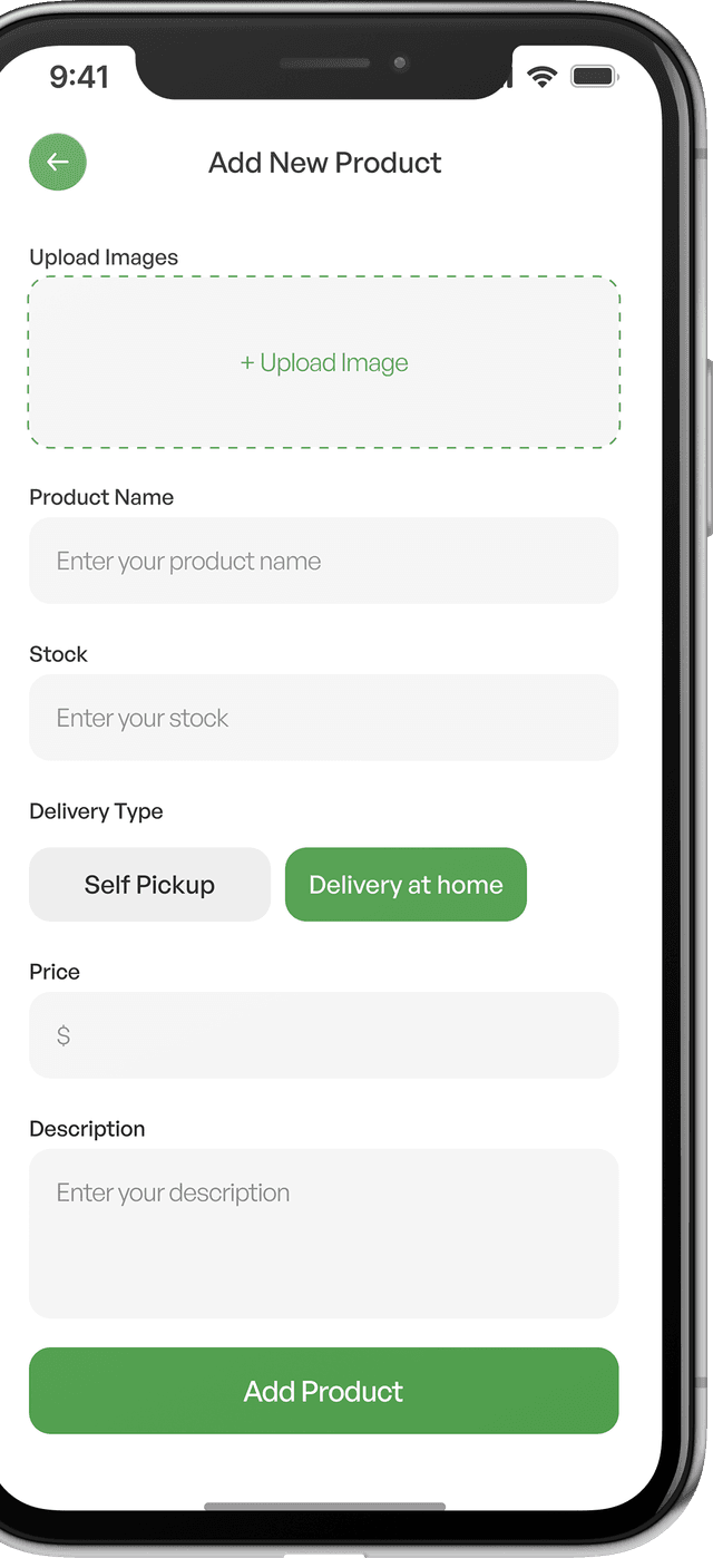
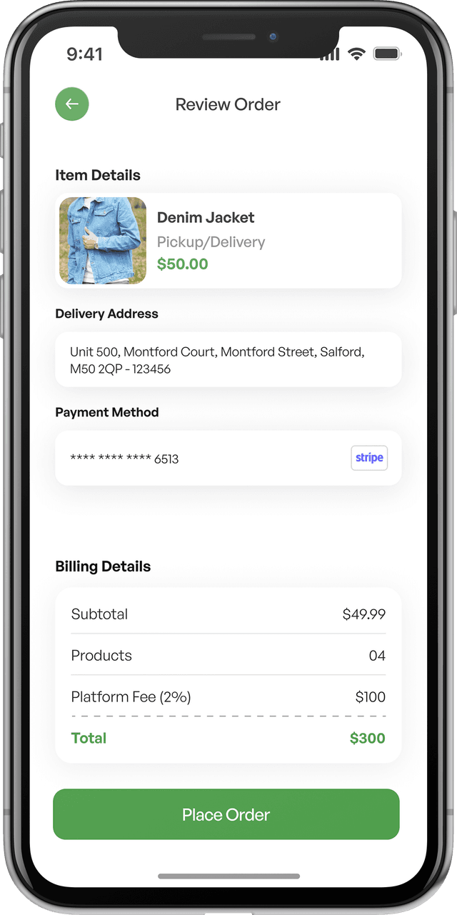
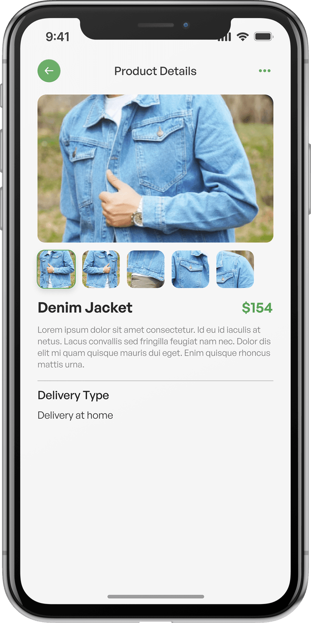
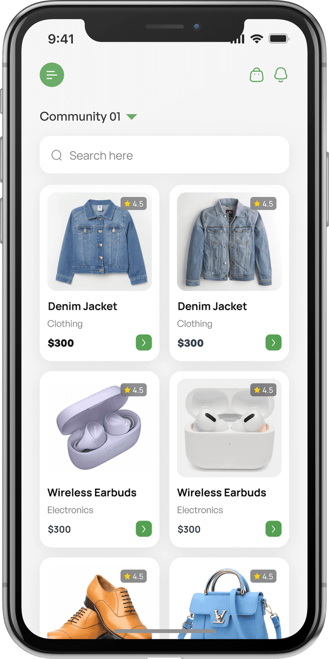
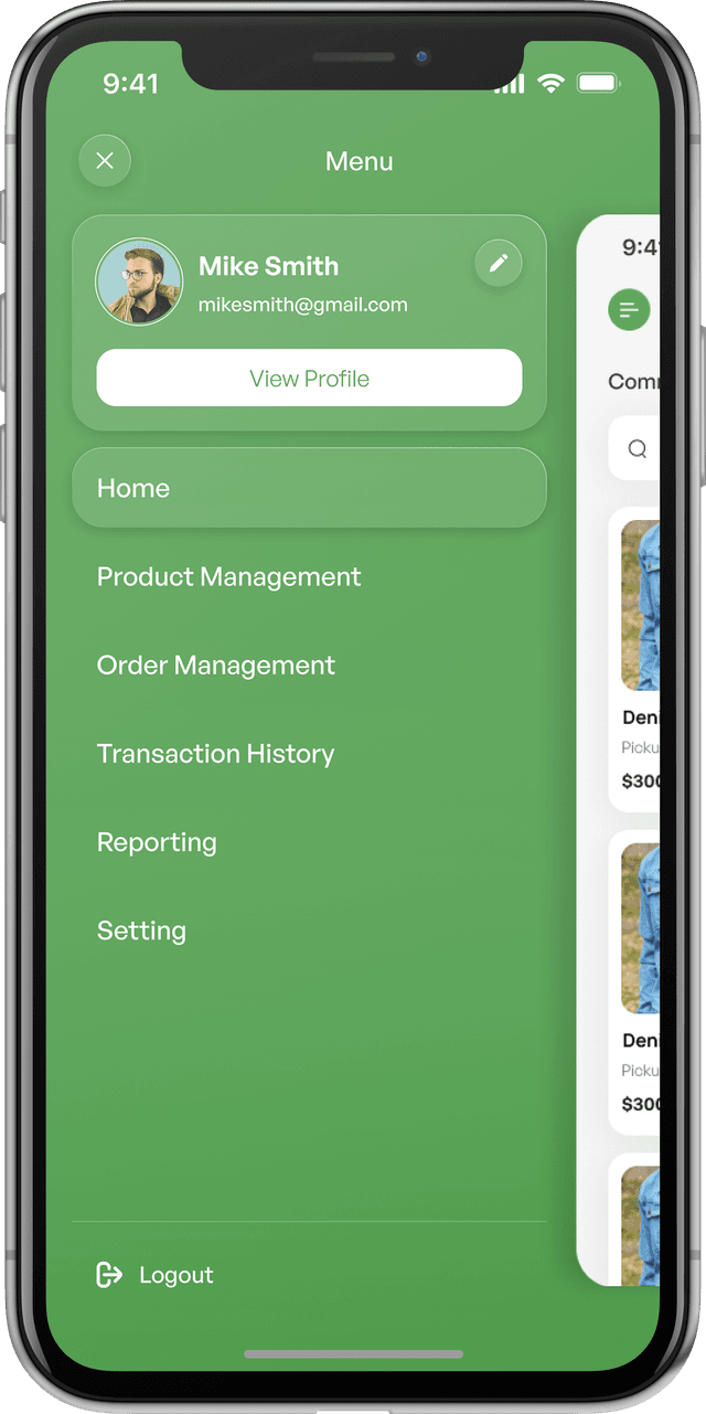
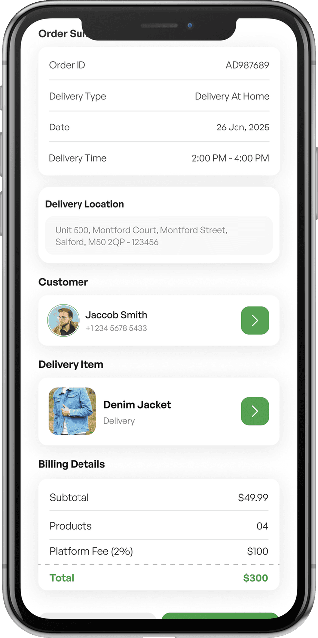
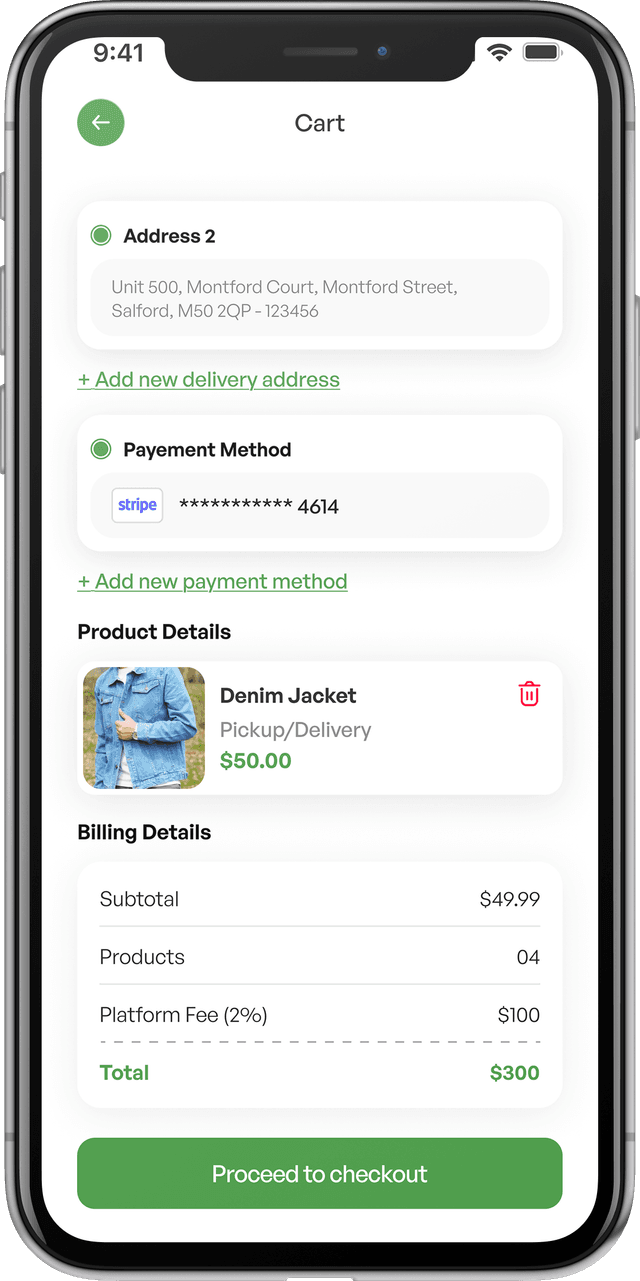
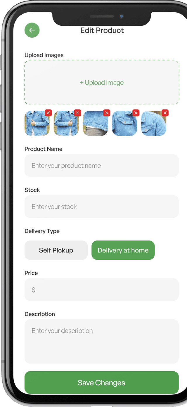
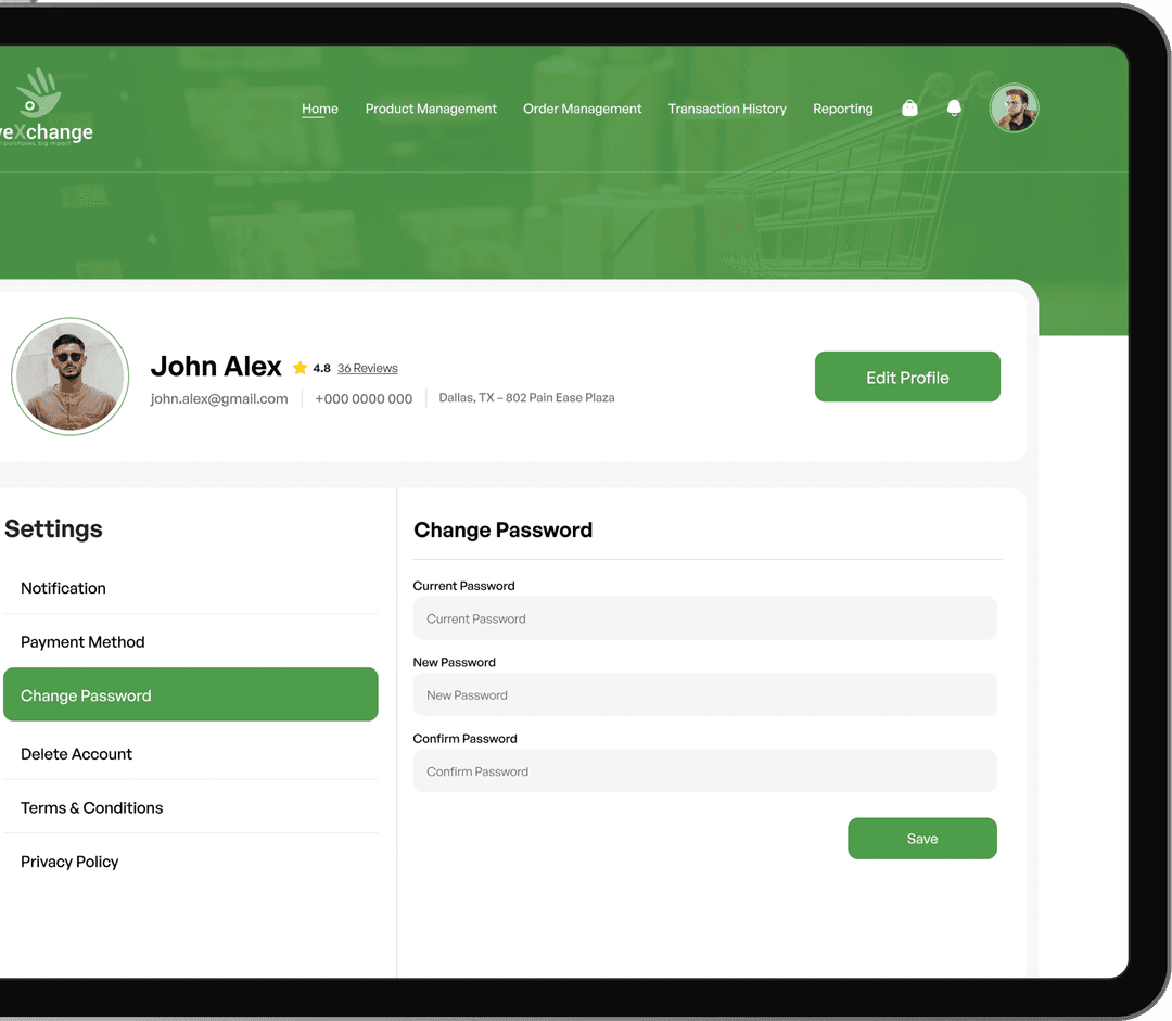
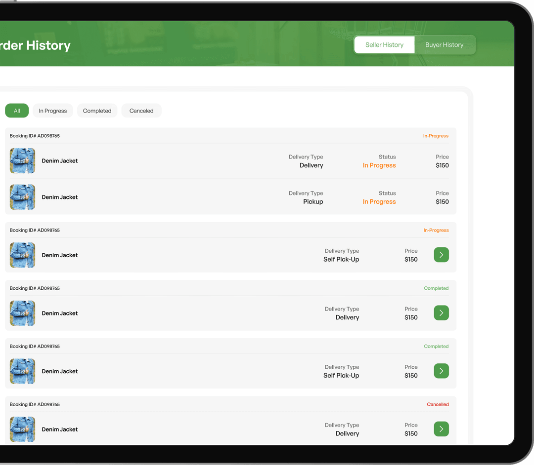
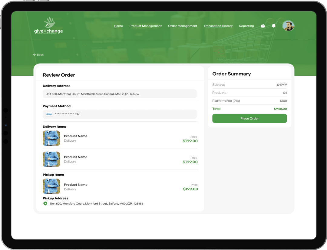
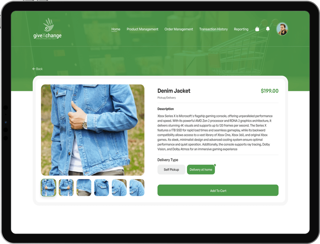
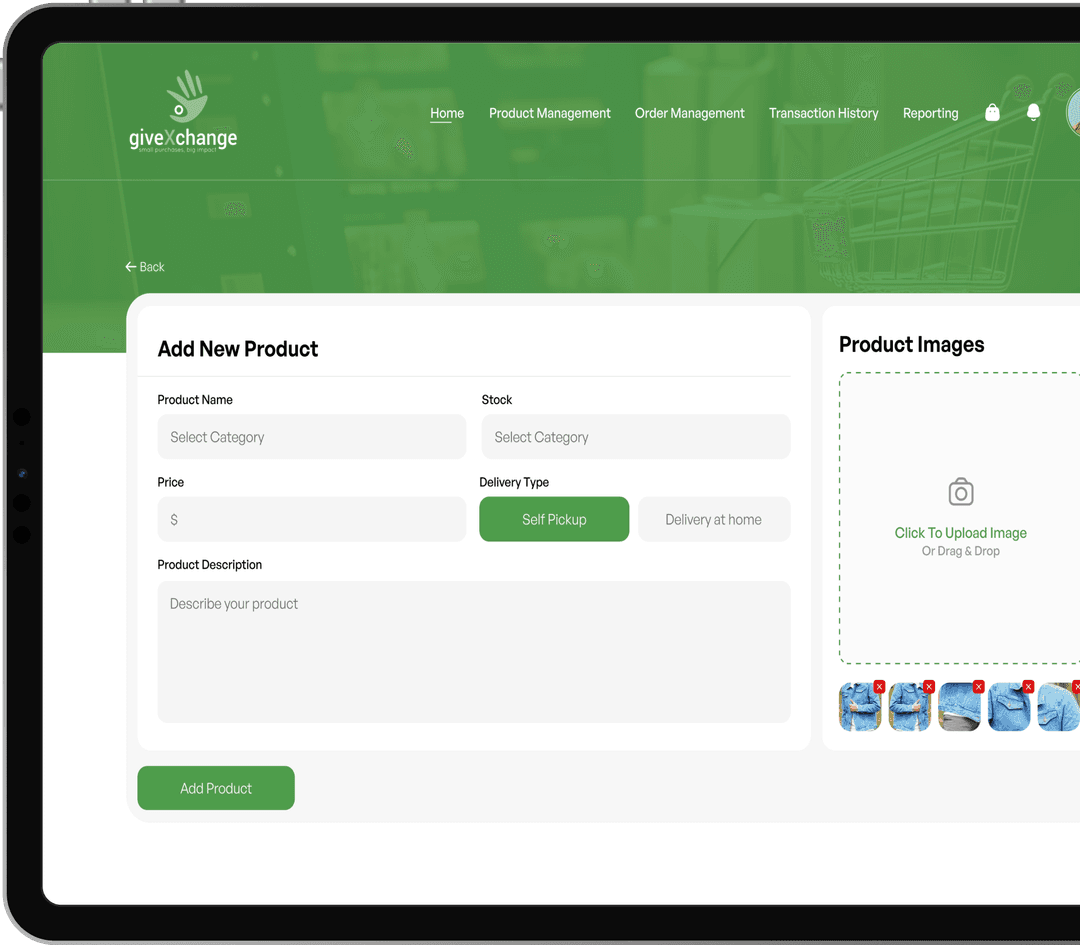
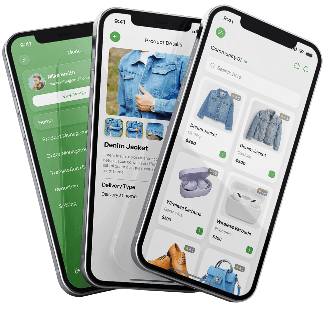
The final product delivers a cohesive, user-centered marketplace experience across both mobile and web platforms, designed to support smooth browsing, efficient transactions, and clear communication. The mobile app focuses on simplicity and speed, presenting users with a personalized feed, structured categories, detailed product pages, secure checkout, and real-time messaging—ensuring every interaction feels intuitive and reliable. On the web, the interface extends these capabilities with enhanced management tools for sellers and admins, including streamlined product uploads, detailed analytics, and full control over categories, users, and transactions. Together, both platforms create a unified ecosystem that balances usability with functionality, empowering buyers and sellers while providing admins with the oversight needed to scale confidently.
Ready to build a fast, scalable, and user-friendly community marketplace?
Let LaunchBox Global turn your vision into a fully functional, growth-ready platform.